Research Findings
Our research was divided into two parts: competitive analysis and semi-structured interviews. For our competitive analysis, we looked at various applications that addressed the same problem we identified; we then analyzed the pros and cons for all of those competing services. Although we originally intended to improve users' overall environmental friendliness through usage tracking features for water and other resources, we decided from our research that it would be best to focus on one aspect of environmental care. This was because we found that sustainability was an immensely complicated subject to tackle, and as a result our project would get over-complicated if we attempted to implement all these topics into one solution.
For our semi-structured interviews, our team interviewed five different people: four University District residents (from sororities, fraternities, and off-campus houses/apartments) who represented potential users, and one subject matter expert (SME) from Seattle Public Utilities who represented a potential stakeholder. It was important to include an SME since, as someone who worked behind the scenes with disposal and sustainability, our subject matter expert would be the individual who could best assess our designed application for practical use.
Our team created questions based on key insights we gathered from our interviews. These questions were meant to help us better understand common user behaviors, experiences, and attitudes, and served as an important starting point in figuring out how to best design for our users. We then combined our data through the use of affinity diagramming, where common traits, attitudes, and experiences were grouped into clusters. This step was essential in creating and refining our personas because they would be based on our interview data and assumptions.
From our user research, we determined that users:
-
Mostly do not know where or how items, both common and uncommon, are disposed
-
Generally think of waste disposal as an inconvenient process
-
Desire a quick and easy way to understand how to dispose of an item and make a decision
-
Own and are comfortable with using consumer technology (laptops, mobile phones)
Individual team member findings of interviews and competitive analysis can be accessed below:
 |  |
|---|---|
 |  |
 |  |
 |  |
Personas
Using the information we gathered from our research findings, our group began the process of creating user personas. From our affinity diagramming exercise, we identified common themes and used these themes to build a provisional persona that addressed categories such as user traits, desires, goals, pain points, and context scenarios. Although we interviewed five people in all, participants either expressed caring about the environment or held little interest. This became the main personality trait that differentiated our two polished personas.
Because not all of our interview participants were students, we decided one persona would be a current UW student while the other would be a recent college graduate subletting a room in a fraternity. We began drafting our personas in class, then received feedback from our peers. One common critique we received was that our draft persona was too broad because it covered a range of demographics and characteristics rather than distinct, individual traits. As a result, we chose to revise our personas to make them feel more like actual people.
After spending time refining our personas' various traits and aspects, we created two polished personas based on our user research that would guide us through the rest of our design process.
 Provisional Persona - Garth |
|---|
 Provisional Persona - Jo |
 Polished Persona - Garth |
|---|
 Polished Persona - Jo |
Design Requirements
We began to curate design requirements based on the information we gathered from our user research and personas. These are the capabilities and information that users would need so that they can manage their waste quickly and efficiently with minimal disruptions to their daily life. We decided to accomplish this through the “action, object, context” and “data, functional, contextual” methodologies.
These are some of our modified design requirements after getting them critiqued:
-
Correctly identify where to put items at disposal site
-
Use camera function to determine the most appropriate disposal receptacles (compost, recycling, garbage) when throwing away take-out at the HUB
-
Enter in zip code that will connect to Google Maps APIs so that it brings up zip code-specific disposal information and locations
-
Recent sort history will have past items queried through text, image, and voice functions based on date and how often the user is disposing of the item, allowing quick access
Design Sketches
With our personas and design requirements completed, we began to brainstorm as many design ideas as we could. This was done both individually and in groups. We then pooled our ideas together and critiqued our sketches by discussing the strengths, weaknesses, feasibility, and originality of each of our ideas. From here our group was able to choose the three most promising ideas and refine them. By analyzing the strengths and weaknesses of these refined sketches, we laid out the groundwork for creating our storyboards and overall flow.
 Refined Sketches - Home Screen |  Refined Sketches - Map |  Refined Sketches - Calendar |
|---|
Below are screens of our initial sketches.

Storyboards
The design process of our app now moved into storyboards which the group did individually. Each of us completed one hand-drawn and one photo storyboard. This was an important process for our group because it allowed us to make the possible narrative connections and interactions our app could have in the real world. Storyboarding brought life into the user research, personas, and rough design sketches we had previously completed.
Looking back, the contents of our storyboards might have been very rough and different from our final design. However, storyboarding was an essential stepping stone towards the evaluation of our design ideas. The experience a user might have with our product in terms of key path scenarios and potential roadblocks is captured in these narratives.
 |  |  |
|---|---|---|
 |  |  |
 |  |  |
Sitemap
Our sitemap outlined the navigation of our application. The hierarchy of the application is based on frequency of use and general usefulness as determined by thought towards various use scenarios and the personas we generated. The layout represented by the sitemap was kept throughout generation of a paper prototype, wireframes, and high-fidelity screen mockups.

Paper Prototype
Our paper prototype and the testing conducted with it was meant to identify major issues in the navigation, purpose, and UI of our application. Our paper prototype consisted of three series of low-fidelity screen mockups, each representing a use scenario of our application. Our tasks and the decision choices we made to help the user achieve them are based on the outcome of our user research and our own perceptions about the clarity and speed associated with various design elements. The results from our paper prototyping were used to drive the next generation of design choices needed to produce wireframes.
Task 1:
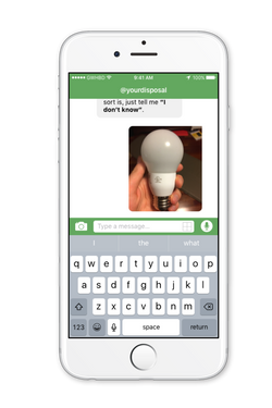
Find a pick-up service to dispose of a laptop. This task tests the ability of our app’s text sort function to discern items that can not be disposed of via normal municipal waste receptacles. The user is tasked with finding the proper disposal method for a laptop and chooses to use the text sort method. Because a laptop can not be disposed of in normal waste receptacles, the user finds information on a local facility that offers pick-up service.

Task 2:
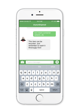
Use image sort to properly dispose of an ice cream container. In this scenario, the user is trying to find the correct receptacle (i.e. trash, recycle, compost) for a plastic ice cream container. The user communicates the physical properties of the container by using an image-recognition software and answering questions. The app determines that it can be recycled, but not before being washed out.

Task 3:
Mark a calendar with a drop-off time and date to dispose of a fridge The user must dispose of a refrigerator. Knowing that it must be taken to a facility for disposal, the user seeks detailed information for one of the nearby facilities. The user finds the facility that best fits their needs and uses the in-app calendar to record a time frame that works for them.

For the next phase, we took our paper prototypes and conducted a quick evaluation with various users. Our team moved forward to the quick evaluation and usability testing phase of this prototype with variety of users. Because we had conflicting schedules, it was much more difficult to conduct these evaluations as a team, which forced us to make multiple copies of our prototype for these tests. We did our best to create the same protocol and evaluation delivery in addition to recording the results. We also conducted pre- and post- observation interviews.
Our team outlined three tasks for users to complete. These tasks were previously outlined in our paper prototype and were based on some of the core design ideas we had:
-
Find a pick-up service to dispose of a laptop with the text sort function
-
Use the image sort to properly dispose of an ice cream container
-
Mark a calendar with a drop-off time and date to dispose of a refrigerator at a facility that can accept such items
User demographic: We cast a wide net in terms of potential users with 4 students and 2 young professionals. Half of our participants considered themselves to be average technology users, while the other half considered themselves to be more advanced. One participant majored in Informatics, while another used a lot of technology in his work that was not directly related to his Geology major. All users practiced various degrees of disposal management (recycling, compost) beyond throwing away garbage.
Once we all completed our interviews, we went over the results as a team and started to zero in on known and unknown issues encountered. We noted the various thinking processes and pathways our users took to complete each task. We coupled these findings with possible solutions, strengths and suggestions into a single document.
A brief overview of these findings are as follows:
-
The app layout, language and screens were not uniform throughout the prototype. The home screen had the most confusion that bottlenecked completing all other tasks, a app breaking issue for one of the first screens a user will see. Our strategy to resolve this in the future was to redesign the home screen and ensure it and the rest of the screens had a consistent unified design.
-
Adding a button that allowed the mini calendar to expand to a full screen calendar would minimize the awkward transitions the users went through in completing the third task. There was a sense of redundancy that caused much confusion with the navigation. Our team went over the work flow for the calendar again to see if there was a way to make the transitions more intuitive.
-
The filter screen that was on the map page was not recognizable by users. Although there was a chance these struggles with the filter were due to the poor quality of some of our prototype screens, we wanted to consider these findings and had deep discussions on what to do. The findings here made us really rethink about some of the assumptions and previous firm design ideas we made on design icons and layouts on the map screen. In closing, we strived to make sure our high-fidelity prototypes and wireframes were of higher quality while at the same time making the filter screen layout simpler with fixed sections.
Quick Evaluation Findings


Annotated Wireframes
Our usability testing revealed some notable design issues that our group needed to address in future design iterations. As a result, our group reconsidered all of our previous findings. Using our information architecture to revise a better sitemap, our paper prototypes as a design basis, and our recent usability testing results as notes for improvement, we began considering a suggestion to implement conversational UI as part of our application for uniformity and more empathic interaction. We then began digitizing our application into wireframes using a design tool called Sketch. These wireframes were intended to be low-fidelity (lo-fi): quick and easy translations of our design concepts into testable artifacts. Therefore our lo-fi wireframes had little color and had several placement holders for both text and images/icons. As opposed to our high-fidelity mockup and our paper prototype, we proceeded to wireframe the entire system of our application to gain more clarity on the breadth of our project.
For our project, the last step was creating high-fidelity mockup screens for our application. After we had received more in-class critiques from our peers, we chose to revise our application's design to be more like a conversational UI by removing and reconfiguring a number of features that were conflicting with the conversational UI aspect. With these critiques in mind, we also replaced the text and image placeholders with actual icons and text, and came up with a more defined color scheme and layout as well.
We chose a shade of yellow-green for the primary color of the application that wouldn't be too vibrant or too dull, and centered the rest of our application's color scheme around that shade. We made sure that font layout and displays would be consistent throughout the app, which was a challenge when considering the number of different-sized speech bubbles our group made for the high-fidelity mockups.
More importantly, creating the high-fidelity mockups in Sketch helped us to implement design revisions and showcase them in a more visually pleasing and professional manner.
 |  |
|---|---|
 |  |
 |  |
 |  |
 |  |
 |  |
 |  |
 |  |
 |  |
 |  |
 |  |
High-Fidelity Mockups
Group Reflection
This was a very fun experience for our group overall, even if it was intense and pretty challenging at times. The biggest challenges we encountered were over design decisions that left us at a stalemate for hours at a time. Some of these heated discussions included decisions such as:
-
Whether to implement full conversational UI
-
If we should we have horizontal or vertical movement across our screens
-
What features were most important on the homescreen
-
Whether we needed a calendar or not
If we had more time, more research and user testing would definitely have been valuable in figuring out what truly would have been the best decision to make the sorting process for our user group as efficient as possible. However, it was incredibly useful to have peer-critique sessions that would allow us to pilot these ideas.
We also did not have time to look into what medium would be the best way to reach out to our users. We could have tested if a website, text service, poster, or another medium would have been the "best" way to convey information. Time constraints and our own personal preferences led us to assume that a mobile application would be the best medium, and so we settled upon building a mobile application.
In addition, the nature of our project forced us to think of a plethora of different possible scenarios our users might go through and many different categories and subcategories of disposable items, since the topic of sustainability and eco-friendliness is certainly a complex one. As such, we definitely did not think of every possible problem to address within just one quarter. However, the time we had to work on this project allowed us to consider what was manageable and doable in such a short period of time, and helped us from overloading our application with too many features and functions.
As a team, we worked really well together. We were almost always on top of it and managed to get things done, even with bumps along the road. Even though it won’t always be this way, we got lucky that we ended up with a group that got along so great. Throughout all the hard work we still managed to keep up a sense of humour which kept up group morale. Whenever our schedules allowed it, we met up in person, and when we couldn’t, we had plenty of Google Hangout sessions to get things done.
 |  |
|---|---|
 |  |
 |